Best Paint Colors for Sun-Filled Living Spaces
There’s something undeniably uplifting about a sun-filled living room. Natural light makes a space feel bigger, warmer, and more inviting. But all that sunlight also changes how paint looks on your walls—and if you’re not careful, the color you loved in the store can feel completely different once it’s up in your space.
Sunlight has a way of amplifying color undertones, washing out muted tones, or even creating glare if the wrong sheen is used. That’s why choosing the best paint colors for bright sunny rooms isn’t just about picking a favorite shade—it’s about understanding how light works in your home.
In this post, we’ll walk you through how natural light affects color perception, what types of hues work best in sunny spaces, and how to create a look that feels balanced, refined, and comfortably bright.
Understand How Natural Light Affects Paint Color
Before selecting a paint color for a bright room, it’s important to consider how sunlight interacts with it throughout the day. The direction your room faces and the amount of natural light it receives can dramatically change how a color looks on the wall.
Here’s how different lighting directions typically affect color:
- South-facing rooms receive warm, consistent light all day. Colors tend to appear more vivid and warm. This makes them ideal for cooler colors like soft blues or greiges to balance the warmth.
- East-facing rooms get warm, bright light in the morning and cooler, bluish light in the afternoon. Warm tones like peach, gold, or coral can enhance the morning glow.
- West-facing rooms experience shadowy mornings and golden light in the evening. Rich, warm shades come alive in this light—just be careful not to overdo red or orange tones.
- North-facing rooms typically have soft, indirect light, which can make colors appear cooler. These spaces can benefit from warmer hues to offset the lack of direct sun.
Even within the same home, one shade can look dramatically different from one room to the next. That’s why testing paint samples on multiple walls and checking them at different times of day is critical, especially in rooms flooded with light.
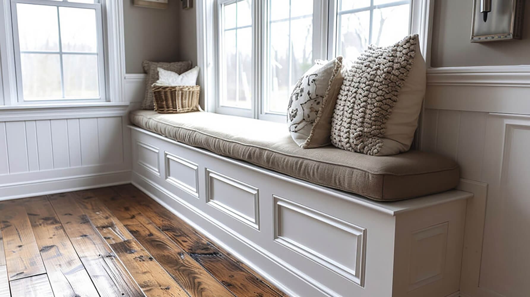
Top Neutrals That Look Clean, Not Washed Out
Neutrals are a popular choice for sunny rooms, but in spaces with a lot of natural light, some neutral tones can appear stark, flat, or overly reflective. The key is to choose shades with the right undertone to hold their character when exposed to bright sunlight.
Here are a few neutral options that tend to perform well in sunlit rooms:
- Warm grays – Look for grays with taupe or beige undertones. These offer softness without feeling cold or sterile.
- Greige – A balanced blend of gray and beige, greige maintains warmth and subtle contrast in daylight.
- Creamy off-whites – Instead of stark white, opt for off-whites with warm undertones like ivory, linen, or almond. These tones feel cozy and won’t glare in sunlight.
- Soft taupe – This adaptable color adds a bit more depth than beige or gray and feels earthy yet refined.
- Pale sand or putty – These tones offer subtle warmth without absorbing too much light.
Avoid overly cool or pure bright whites, which can look harsh or washed out in full sun, especially on large wall surfaces. And always test these shades in your actual space before committing—lighting makes all the difference.
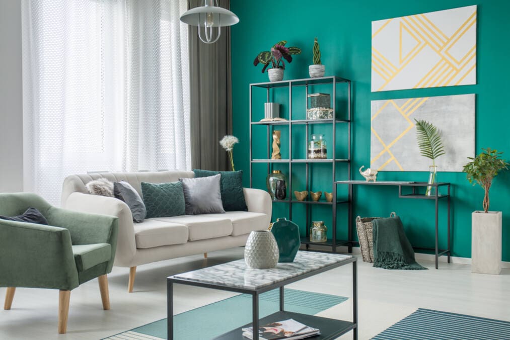
Muted Colors for a Sophisticated Glow
If you want to add some personality without overwhelming a sunny room, muted colors are a smart, elegant choice. These shades offer a gentle wash of color that complements the natural brightness without competing with it.
Here are a few timeless muted tones that work beautifully in sun-filled spaces:
- Soft blues – Pale or dusty blue tones can feel calming and expansive in bright rooms. They pair well with white trim and natural textures like wood or linen.
- Sage green – This understated green brings an earthy calm to the space and works well with wood finishes, black accents, or brass hardware.
- Blush or dusty rose – A touch of pink in the right muted tone can add warmth without feeling overly feminine or trendy.
- Muted lavender or mauve – These cool-toned shades offer a hint of personality and are especially nice in east- or west-facing living rooms.
- Pale terracotta – Soft, sunbaked clay tones create a cozy, sunlit ambiance that feels grounded yet modern.
Muted colors work best in matte or eggshell finishes in living spaces. These finishes diffuse sunlight softly across the walls, reducing glare and giving the room a smooth, even look.
When to Use Bold or Dark Colors in a Sunny Room
It might seem counterintuitive, but sun-filled rooms can actually be the best places to experiment with bold or dark paint colors. Natural light helps keep deeper tones from feeling too heavy or overwhelming, creating a cozy, dramatic contrast that’s still bright and inviting.
Here’s when and how to use darker colors effectively in a bright space:
- Add contrast – In rooms with lots of white trim, windows, or light furniture, a bold wall color can ground the space and add visual depth.
- Highlight architectural features – Use darker tones to draw attention to built-ins, fireplace walls, or millwork.
- Try accent walls – If you’re not ready to commit to an entire room, painting just one wall in a rich hue adds personality without overpowering.
- Pair with warm lighting and soft textures – Darker colors like navy, charcoal, or forest green can still feel inviting when paired with layered lighting and cozy furnishings.
Great bold color options for sunny rooms include:
- Deep navy or slate blue
- Rich olive or forest green
- Charcoal gray with warm undertones
- Dusty plum or aubergine
- Muted black (especially in matte finish)
The key is balance—sunlight makes dark colors pop without making the room feel closed in, as long as the space has enough natural light to support it.
Color Choice Should Support the Light, Not Compete With It
Sunlight is one of your home’s greatest assets—don’t fight it with the wrong paint color. When choosing the best paint colors for bright sunny rooms, your goal should be to enhance the natural light, not mute it or clash with it.
Here’s a quick recap of what to keep in mind:
- Light direction matters – Know whether your room faces north, south, east, or west, and choose colors that complement the temperature and intensity of that light.
- Neutrals need depth – Warm grays, creamy off-whites, and taupes work better than flat white in sunny spaces.
- Muted colors glow softly – Soft greens, blues, and blush tones bring a quiet personality without overpowering the room.
- Bold shades need light – Deep, rich hues can be stunning in bright rooms where the natural light keeps them feeling lively and fresh.
Still not sure where to start? Choosing paint colors can feel overwhelming, especially when lighting plays such a big role in the final look. That’s where we come in.
Prep Smart Painting offers professional color consultations to help you confidently choose a palette that complements your space, your style, and the light your home naturally offers. Request a color consultation or interior painting quote today. Let’s bring out the best in your home’s light-filled spaces.