Choosing the Perfect Interior Paint Colors: A 4-Step Guide
Choosing the perfect interior paint colors for your home can feel like a daunting task. With endless options available, it’s easy to feel overwhelmed. You might wonder: What color will make my living room feel inviting? How can I make my bedroom a peaceful retreat? Will this color even look good once it’s on the wall? These are common concerns, and you’re not alone in facing them.
The truth is, the paint color you choose has the power to completely transform your home. It can make a small room feel spacious, create a cozy ambiance, or even set the tone for productivity and relaxation. But making the right choice requires more than just picking a color that looks good on a swatch.
In this four step guide, we’ll break down exactly how to choose the perfect interior paint color for your home. We’ll cover:
- How colors influence mood and the function of a space.
- How lighting impacts the appearance of paint shades.
- How to coordinate paint colors with your furniture and décor.
- Why it’s important to balance trends with timeless choices.
By the end of this guide, you’ll have the tools and confidence to select a color palette that not only looks stunning but also feels just right for your home. Let’s dive in!
Step 1 – Understand the Mood You Want for Each Room
Before you choose the perfect paint colors, think about the mood you want to create in each space. Paint isn’t just about aesthetics—it has a powerful influence on how a room feels and how people experience it. Let’s explore how to align your paint choices with the emotions and functions of the room.
Colors Affect Emotions
Colors can evoke certain feelings and set the tone for your space. For example:
- Blue is known for its calming and serene qualities, making it perfect for bedrooms or bathrooms.
- Yellow is an energizing, cheerful color that works well in kitchens or playrooms.
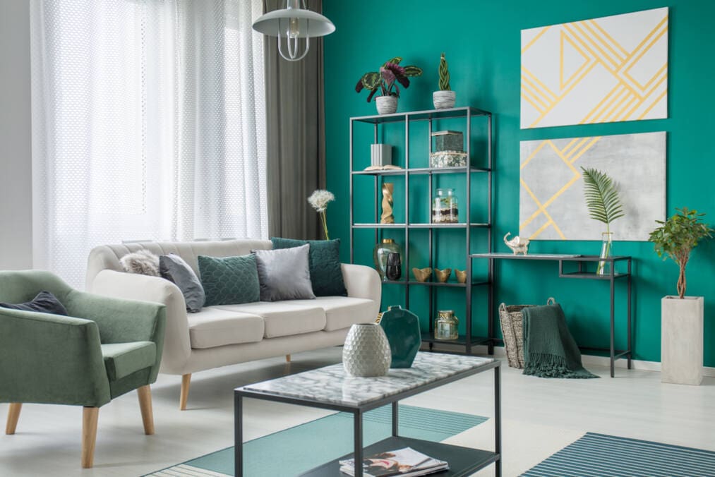
- Green symbolizes balance and harmony, making it a great choice for offices or living spaces.
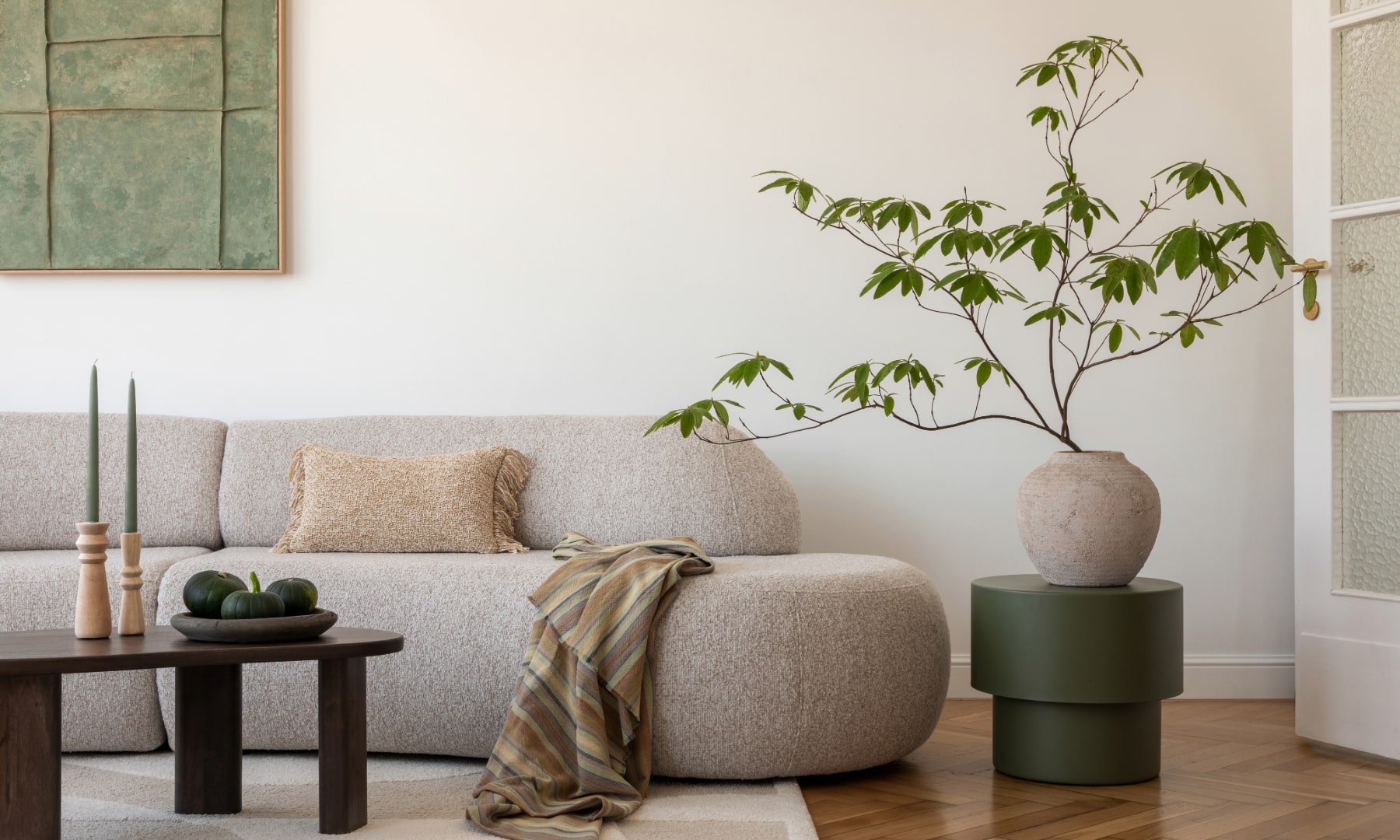
- Neutral tones like beige, gray, and off-white provide a timeless and versatile foundation for any room.
When choosing a color, ask yourself: How do I want this room to feel? Whether you want a cozy retreat or an energetic hub, the right color can help set the mood.
Consider How the Room is Used
The function of a room plays a huge role in determining the right paint color. Think about how you and your family use the space:
- Bedrooms: Opt for soft, calming tones like light blues, greens, or warm grays to create a peaceful atmosphere.
- Living Rooms: Choose versatile and inviting colors such as beige, taupe, or muted greens that encourage relaxation and conversation.
- Home Offices: Go for focused colors like soft greens or light yellows to boost productivity without overstimulating.
- Dining Rooms: Rich tones like navy, burgundy, or deep greens can create an intimate and sophisticated dining experience.
Each room serves a different purpose, and your paint colors should work to enhance those unique functions.
Step 2 – Factor in Lighting Before Choosing a Shade
One of the most important—and often overlooked—factors when choosing paint is lighting. The same paint color can look drastically different depending on the light in the room. Understanding how lighting affects color can save you from regretting your choice later.
Natural Lighting vs. Artificial Lighting
- Natural light: Rooms with plenty of natural light can make colors appear brighter and more vibrant. Keep in mind that the direction of the light matters:
- North-facing rooms: Cooler and dimmer light can make colors appear slightly darker, so it’s best to avoid overly cool tones.
- South-facing rooms: Warm and bright light enhances most colors, especially warm tones like yellows, oranges, and soft whites.
- Artificial light: The type of bulbs you use also affects color:
- Warm bulbs can make colors appear cozier and more golden.
- Cool bulbs may highlight cooler tones, like blues and grays, but can make warm tones feel washed out.
Test Swatches in Different Lighting Conditions
Before committing to a color, always test paint samples in your space. Apply swatches to multiple walls and observe how the color looks:
- During the day with natural light.
- At night with artificial lighting.
- In areas with shadows or direct light.
Taking the time to test swatches ensures you’ll be happy with your choice in all lighting conditions.
Step 3 – Coordinate Paint Colors With Existing Décor
Your paint color doesn’t exist in a vacuum—it needs to complement the furniture, flooring, and décor in your home. A harmonious color scheme ties everything together and creates a polished, cohesive look.
Use a Color Palette
Start by building a color palette based on existing elements in your room. For example:
- Match your wall color to an accent color in your furniture, rugs, or artwork.
- Use complementary colors (opposites on the color wheel) for a balanced and visually appealing look.
- Stick to a warm or cool theme throughout your home to maintain consistency.
A well-thought-out palette ensures that your paint choice enhances your space rather than clashing with it.
Don’t Forget About Trim and Ceilings
Trim and ceilings are often overlooked but play a crucial role in the overall look of a room. Some tips to consider:
- Trim: Crisp white trim is a classic choice that works with almost any wall color. For a bolder look, consider a contrasting trim color.
- Ceilings: While white is the standard, experimenting with lighter shades of your wall color can add a subtle, cohesive touch.
These small details can make a big difference in the final result.
Step 4 – Keep Trends in Perspective
Trendy colors can be exciting and fresh, but they’re not always the best long-term choice. It’s important to strike a balance between staying on-trend and creating a timeless look.
Embrace Trends in Small Doses
If you love a trendy color, consider using it in smaller spaces or as an accent color. For example:
- Use bold colors on an accent wall rather than painting an entire room.
- Incorporate trends through accessories like pillows, rugs, or curtains that can easily be changed.
This allows you to enjoy trends without committing to a full repaint if they go out of style.
Stick to Timeless Choices for Larger Areas
For large spaces like living rooms and kitchens, timeless neutrals are often the safest bet. Colors like soft whites, grays, and beiges provide a versatile backdrop that works with changing trends and styles.
Timeless colors also make it easier to sell your home if you ever decide to move.
Recap and Next Steps
Choosing the best interior paint color doesn’t have to be stressful when you approach it step by step. Remember to:
- Think about the mood and function of each room.
- Consider how lighting impacts the appearance of colors.
- Coordinate your paint choices with your existing décor.
- Balance trendy colors with timeless options.
If you’re still unsure, don’t worry—you don’t have to do it alone. At Prep Smart Painting, we specialize in helping homeowners like you create spaces they love. From expert color consultations to professional interior painting services, we’re here to make the process easy and enjoyable.
Ready to transform your home? Contact us today for a free consultation and let’s bring your vision to life!