How to Choose Wall Colors That Match Your Furniture and Flooring
Paint is one of the easiest ways to transform a room — but choosing the right color is anything but simple. Too often, homeowners choose wall colors in isolation, only to discover later that the result clashes with their furniture or flooring.
That’s where things get frustrating — and costly.
If you’re wondering how to match wall paint color with furniture, the answer starts with understanding your space, not just picking a trendy swatch. Paint should complement the pieces you already love, not fight against them. And when done right, it ties everything together effortlessly.
Let’s explore how a professional approach to color pairing can help you create a balanced, cohesive space — one that feels designed, not improvised.
Start with the Elements That Aren’t Easy to Change
When designing a room, begin with what’s permanent. Paint is flexible. Flooring and large furniture are not.
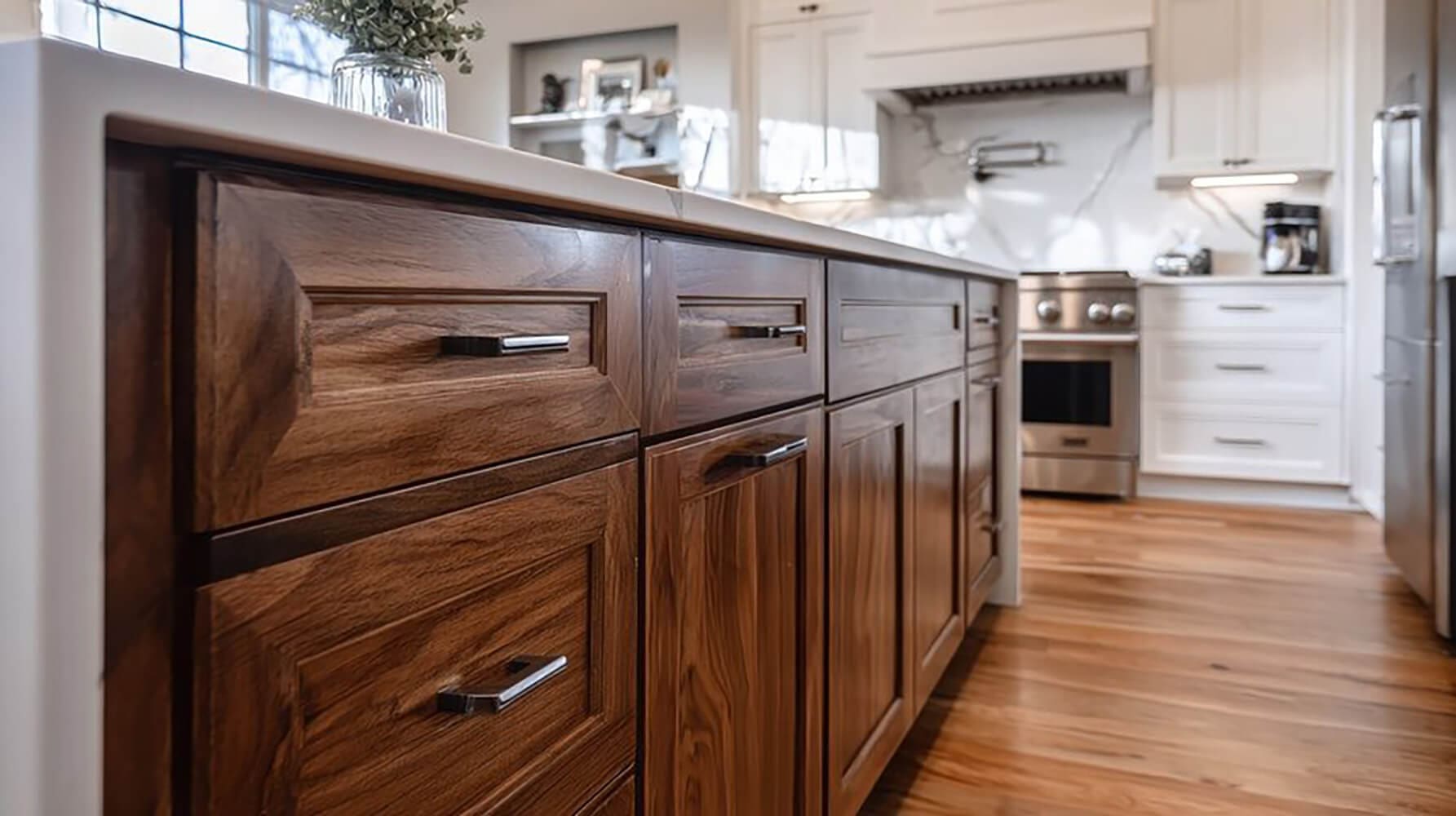
Floors, sofas, cabinets, and built-ins are investments that often define the space. They’re not easily replaced or adjusted. That’s why they should guide your wall color selection, not the other way around.
If you pick a paint color first, you may find it clashes with your couch, wood tones, or rug patterns. Professionals avoid this by building a color strategy around your room’s foundation.
Here are the items that should come before any paint decisions:
- Hardwood flooring or tile – The undertone in wood or stone can shift how wall colors appear.
- Upholstered furniture – The dominant color and fabric texture affect how much contrast you want.
- Cabinetry and trim – These fixed elements set the tone for any adjacent wall color.
- Feature pieces – A bold art piece or area rug may become your visual anchor.
Paint should bring these elements together—not compete with them. A professional painter will look at the entire space before recommending a finish or color family.
Use Undertones to Guide Color Pairing
Color isn’t just about what you see at first glance — undertones shape how everything interacts. Most materials have subtle color notes that affect visual balance. Ignoring them leads to clashing combinations that feel off, even if you can’t explain why.
Wall paint must complement the hidden warmth or coolness in your surfaces. The right match creates harmony. The wrong one draws attention for all the wrong reasons.
Here’s how to identify and respond to undertones:
- Warm undertones – Found in golden oak, beige fabric, and red-toned rugs. Pair with warm neutrals like cream or greige.
- Cool undertones – Seen in gray flooring, blue upholstery, or charcoal tiles. Balance with cool shades like crisp white or icy blue.
- Neutral undertones – Appear in true taupe, black, or off-white elements. These can flex with either warm or cool tones, depending on the lighting.
Professional painters often use large-format swatches to compare undertones in real lighting. This avoids picking a wall color that looks perfect in the store—but turns green or pink at home.
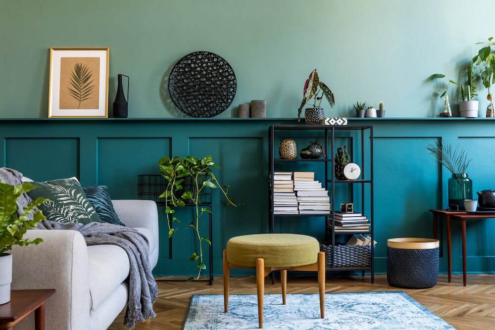
Balance Contrast and Flow Between Walls and Furniture
When choosing wall colors, it’s not just about matching — it’s about finding the right balance between contrast and cohesion. Too much contrast feels jarring. Too little can look flat or unfinished.
This is where paint brings harmony. It can either anchor your furnishings or help them stand out, depending on your goal. The key is to avoid forcing a match and instead aim for flow.
Here are two smart ways to create visual balance:
- Go for contrast when you want drama – Light-colored walls paired with deep-toned furniture create bold definition and visual interest.
- Choose tone-on-tone for calm, subtle design – Pair soft gray walls with charcoal furniture for a layered but peaceful palette.
Avoid trying to match your wall color exactly to your furniture or flooring. It rarely works and usually feels forced. A shade too close — but not quite right — tends to look like a mismatch, not a match.
Professionals can help you find the sweet spot, where everything in the room feels intentional, not accidental.
Test Before You Commit
Even the most carefully chosen paint color can look wrong once it’s on the wall. That’s because lighting, finish, and surrounding materials all affect how colors appear in real life. What looked perfect in a showroom or sample photo may not hold up next to your actual floors or sofa.
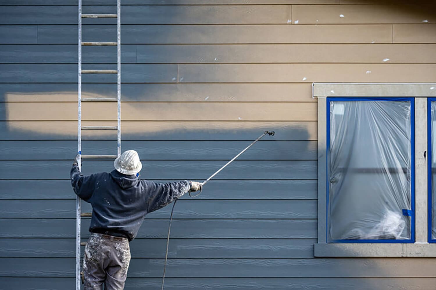
Professionals never guess. They always test.
Here’s how expert painters ensure the color is right before applying it across a full room:
- Sample large swatches – Instead of tiny paint chips, use real paint samples applied directly to the wall.
- Compare in different lighting – View the color in morning, afternoon, and artificial light to see how it shifts.
- Place swatches next to furniture and flooring – Paint doesn’t exist in a vacuum. It must interact well with everything else in the space.
- Check multiple walls – Light reflects differently depending on placement, angle, and shadow.
Paint is a visual investment. Testing saves you from repainting—or worse, living with a color you regret.
Why a Professional Eye Makes All the Difference
Choosing wall paint that coordinates with your furniture and flooring isn’t just about good taste — it’s about understanding how color works in real spaces. And that’s not always easy to do on your own.
What looks great on a swatch may feel completely different once it covers an entire wall. Undertones, lighting, and finish all change how colors interact. That’s why expert guidance can save you from costly repainting or design regrets.
Professional painters and color consultants do more than just apply paint. They look at the full picture — furniture materials, flooring finish, surrounding light, ceiling height, and room function — before making a single recommendation.
Here’s how a pro helps ensure your walls complement the room, not compete with it:
- They evaluate the entire space, not just color chips in isolation
- They compare multiple options in real light, not under showroom bulbs
- They balance color temperature and finish to highlight what you already love in the room
- They prevent common mistakes, like clashing undertones or awkward transitions between rooms
- They work with premium paint products, ensuring lasting results that actually match the design you want
Color may be subjective, but a cohesive, well-balanced room isn’t an accident. It’s the result of thoughtful planning — and a trained eye that knows how to translate your goals into a finished look that feels right from every angle.
Even if you already have a color in mind, a professional can help fine-tune your options and make sure it fits your space, your lighting, and your lifestyle.
Build Your Room Around What You Already Love
Matching wall colors to your existing furniture and flooring isn’t about finding a perfect match — it’s about creating balance. The most successful spaces start with what’s already in place. From there, the right paint adds polish, warmth, and intention.
Let’s recap the smart approach:
- Start with furniture, floors, and fixed features — not swatches
- Pay attention to undertones to avoid subtle clashes
- Use contrast or tone-on-tone depending on the mood you want
- Test everything in real lighting before making final decisions
- Work with a pro to ensure all elements flow together seamlessly
Paint has the power to pull a room together — or pull it apart. If you’re planning a refresh and want every element to work in harmony, a professional color consultation can save you time, money, and second-guessing.
Need help choosing a color that works with your space? An expert painter can guide you through the options and handle the details so your vision becomes reality — no guesswork required.