Interior Paint Color Trends to Watch for 2026
Interior color trends do more than reflect style—they mirror the way people want their spaces to feel. In recent years, that desire has shifted away from sterile whites and loud contrasts. Homeowners are looking for softness, warmth, and colors that support calm, grounded living.
If you’re planning to repaint in the new year, it’s worth understanding the interior paint color trends for 2026. These emerging tones reflect a deeper move toward comfort, connection, and personal expression—while still offering a modern, updated feel.
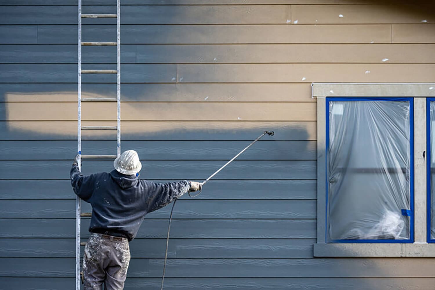
Rather than chasing short-term fads, this year’s palettes build on timeless ideas with a fresh, contemporary twist. Whether you’re updating one room or your entire interior, working with a professional painter can help you apply these trends in a way that feels both current and customized to your home.
Nature-Inspired Neutrals Will Continue to Dominate
If 2025 leaned warm and earthy, 2026 is doubling down. Interior designers and color experts agree—natural tones are staying strong. These muted shades reflect the growing desire to feel calm and grounded at home.
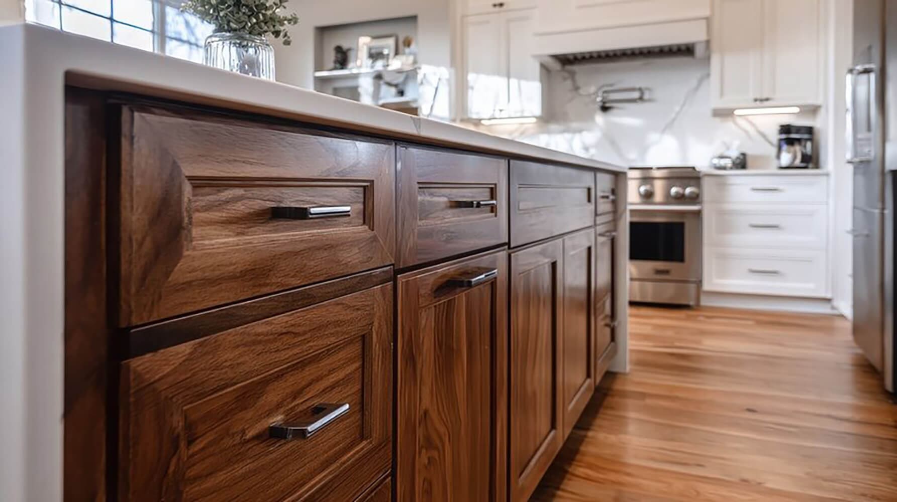
Beige, taupe, soft clay, and mushroom gray are leading the charge. These aren’t the cold grays or stark tans of years past. They carry subtle warmth and pair beautifully with wood tones, textured fabrics, and matte finishes.
What makes these earth-toned neutrals stand out:
- They create a soft foundation for layering decor, art, and accent colors.
- They complement organic textures like linen, jute, rattan, and unfinished woods.
- They feel cozy but not heavy, making them ideal for walls in bedrooms, living rooms, and entryways.
Paint companies have already started highlighting these colors in their early 2026 forecasts. These hues support minimalist design while allowing flexibility across styles — from modern farmhouse to Japandi.
Deep Greens and Muted Blues Bring Balance and Depth
Not every color trend in 2026 leans soft. Saturated shades are also making a comeback — but in more refined ways. Think deep olive, muted navy, stormy teal, and slate blue. These colors don’t shout for attention. They add mood, depth, and intentional contrast to otherwise neutral interiors.
Homeowners are using these rich tones in places that benefit from grounded energy and visual structure. Offices, dining rooms, accent walls, and even powder rooms are perfect settings for these hues.
Why these tones are gaining popularity in 2026:
- They create a calm, cocooning effect that works especially well in bedrooms or private spaces.
- They offer contrast without clashing against natural woods or woven textures.
- They play well with brass, black, and matte hardware, adding design polish to the space.
Using these shades in the right finish is essential. Matte or eggshell keeps them soft, while semi-gloss adds a touch of formality. A professional can guide you on where to use these deeper hues for maximum effect without making the room feel smaller.
Soft Blacks and Charcoals Replace Pure White Contrast
The reign of stark white trims and doors is fading. In its place, deeper neutrals like charcoal, graphite, and soft black are rising. These tones bring warmth, depth, and a more grounded contrast than high-gloss white ever could.
Designers are using these moody neutrals to define architectural details without overpowering the room. They help modernize traditional spaces while hiding wear and fingerprints better than lighter shades.
How darker neutrals are being used in 2026 interiors:
- Trim and baseboards painted in soft black for contrast against warm neutral walls
- Interior doors finished in charcoal for a modern, elevated feel
- Cabinetry accents using deep gray in kitchens, laundry rooms, or built-ins
- Layered palettes with muted tones and textures to keep things from feeling heavy
These colors work beautifully with today’s trending earth tones and richer blues and greens. They create dimension without starkness and look intentional instead of industrial.
Unexpected Pops of Color Show Up in Small Doses
While grounded palettes dominate, designers aren’t afraid of color — they’re just using it differently. Instead of large, saturated walls, bold hues are showing up in accents and unexpected places. These small touches inject personality without overwhelming the space.
Homeowners are using bright or earthy statement colors with more intention. This trend aligns with the growing demand for “design moments” — curated visual highlights that bring energy to a room.
Where you’ll see bold paint colors used in 2026:
- Interior doors painted in bold shades like olive, saffron, or deep terracotta
- Ceilings treated as the “fifth wall,” especially in bedrooms or powder rooms
- Alcoves, niches, or shelves where color creates a visual focal point
- Furniture accents or built-ins that tie into soft wall colors for contrast
Professional painters can help you apply these pops with precision. The right placement and finish keep the effect controlled — never chaotic.
How to Make Trend Colors Work in Your Home
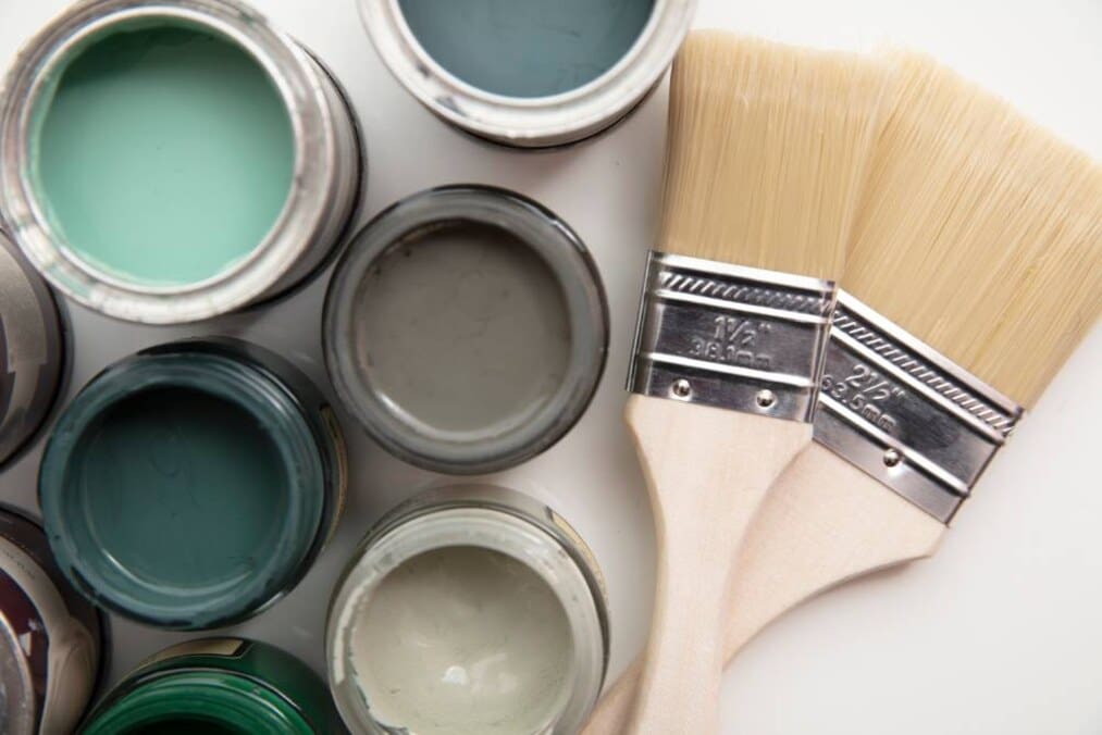
Not every trending color will work in every space. That’s why trend reports should be used as a guide—not a rulebook. What looks stunning in a catalog can fall flat in a room with poor lighting, outdated trim, or conflicting undertones.
Professionals know how to interpret a color trend and apply it with context. They look beyond the swatch to understand what’s happening in the full space—your flooring, window light, ceiling height, and even furniture scale.
Here’s how pros bring trend colors into real homes without overwhelm:
- They test colors on multiple walls to see how lighting shifts tone throughout the day.
- They match undertones so the new paint complements existing floors, cabinetry, and finishes.
- They adjust finishes to balance sheen with traffic patterns, pets, or child-friendly needs.
- They suggest accent pairings or trim contrasts that give trend colors depth and structure.
Using trend colors isn’t about chasing style. It’s about making intentional updates that reflect your lifestyle, mood, and space. And with the guidance of a seasoned painter, you can apply 2026’s color stories in ways that feel both modern and timeless.
Plan Ahead with an Expert Eye
2026 color trends are steering interiors toward warmth, softness, and layered balance. Neutral doesn’t mean boring. Color doesn’t mean loud. The real power lies in using paint intentionally — to support the style, comfort, and energy you want in your space.
Let’s recap what’s on the rise:
- Nature-inspired neutrals like sand, clay, and warm mushroom
- Deep greens and muted blues that add calm and richness
- Charcoal and soft black accents for modern contrast
- Small-scale color pops that express personality without overwhelming the room
Each of these trends reflects a shift away from cold minimalism and toward thoughtful, curated interiors. But applying them well requires more than just picking a swatch from a chart.
If you’re planning a refresh in 2026, a professional painter can help you translate these trends into real spaces that feel like you. From lighting conditions to flooring tones and trim finishes, every detail impacts the final result.
Schedule a consultation now to explore what works best in your home — and bring next year’s colors into your space with confidence.